Signs From Off The Wall With Gabriel Cole

Words by Billy De Luca.
Gabriel Cole is in the middle of shooting a new collection for Hoodle Skateboards when he calls.
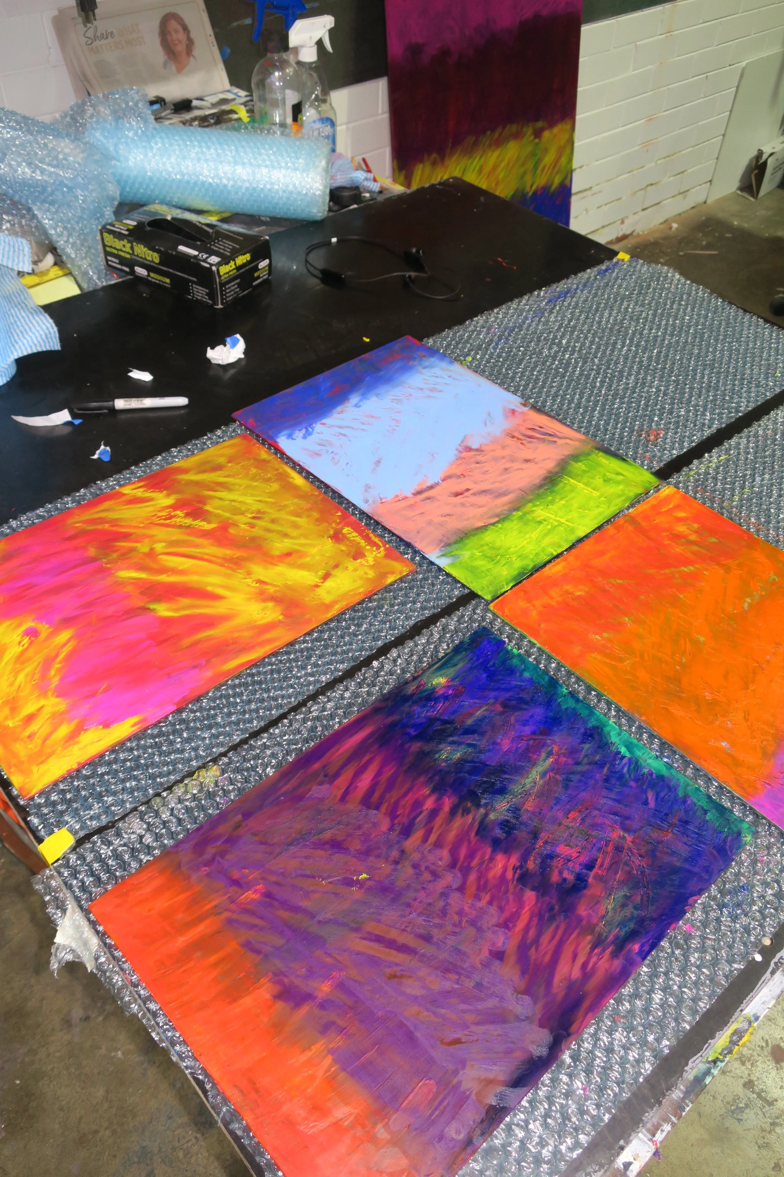
He’s worked with the brand in Melbourne for several years as their Art Director — a fitting role, considering he’s an artist and designer. His latest exhibition, Hot Generation, just wrapped at China Heights in Sydney. Named after the 1967 Aussie surf film, the show was informed by research, intuition and tension. The film immortalised an era of longboarding teetering on the brink of change, featuring Bob McTavish, Peter Drouyn, Nat Young, Robert Connelly, and Midget Farrelly, among other legends that shaped the scene.
A ubiquitous ‘1967’ brandished paintings, and a hanging surfboard and ceramic sculptures shined with lacquer, looking wet with colour. Repetitive imagery mixed with harsh, vivid colours and clean structures. Hectic and challenging, messing with ideas of commercialism and distortion. Cole is busy but disciplined—he got that from being a Paralympian. We talked about his creative process, recurring visual elements, and why the concept of ‘beauty’ is basically bullshit.

So how was the show? Looked like lots of moving parts — was there much oversight from the gallery?
Yeah China Heights was super helpful. I made the show and didn’t really tell them about what any of it was going to be or look like before it arrived. I didn’t show anyone really. It would have felt tainting to the process, so I didn’t overshare too much.
Was the surfboard all you?
The surfboard was a collaboration and really awesome long project with a friend, Jack [Del Rennie], who's an amazing craftsman with a background in architecture and design.
It looks like it worked out pretty well.
It’s all about trusting the process — some things are out of my control, but I was bringing a lot to it. A lot of ideas, a lot of response.
An artwork and design object… can they be both?
I think surfboards are a really interesting design medium. You base them on function and also on feeling. This one was a different process: we wanted to give it more of an art aesthetic.


Yeah, if you’re shaping your own board, it’s for you. You throw your personality into the rails and your tastes into the nose and whatnot.
And we wanted it to feel like a board on the cusp of the end of the longboard era, just before the shortboard evolution when they started chopping 'em down. But it also reflected mine and Jack’s tastes. It was a really personal project. Every decision was ours — we even made the fin.
And now it’s hanging upside down in a gallery.
We wanted it to look as good as possible for the presentation, and after that, once it goes in the water — it's got no leash plug, by the way — It's in God's hands. It'll get dings and fractures over time, but that's part of the process.
And most surfers know how a board will look when it starts to ‘live’ a little. Even when it’s pristine in the gallery, you can imagine it waxed up, dinged and firing.
Yeah, exactly. It's a performany version of that longboard era. There’s lots of excitement about looking at it. It’s got harsh foiled rails and pulls some over the design decisions from the lines and harshness of the paintings and frames.
And why that era?
I identified with it. Longboards and the glider-style suited me better, also because I have a partially deformed arm.
And the ‘1967’ in the show?
The film came out in 1967, so I used that as a starting point and built a logo asset for the show. I like a recurring theme, something that's ambiguous but bold and grounding. It plays into my obsession with semiotics, consumerism, and logos. Like how a tick sticks in your head.
I liked it. It reminded me of the 88 surfboards that started popping up everywhere a few years ago, and we were all like, ‘what the fuck are all these foamies doing back in?’
And it sticks with you. I don’t create anything without a logo or words, but there’s foreplay there, something personal. I don’t want it to be too obvious, but I also want it to be a major part of my work, beyond the painting, ceramics and printmaking.


So why did you start doing all this?
It comes out of a personal place. I was always into clothes, antiques, design—that world resonated with me. I found a desire to create things, but my parents weren't interested in art and I didn't go to a school where it was necessarily pushed. I was into athletics growing up, but slowly found out about art while studying a bit of architecture and design.
How did it feel to get into?
Like how it feels to wear a t-shirt you love. I look at one (design) as about solving a problem and the other (art) being about creating a thing and intending to solve it or not.
And where does a work start?
Coming from a trade-based discipline and going into clothing and painting, the initial phase is always very considered — I often start with a logo — but then let the next moments have their own energy. Then, you work through the tension. I’m always looking for the accidental, impromptu moments and random things that dictate what the next steps are.
Towards where?
Towards having a strong resonating feeling about the thing. In clothing, it's about making something that fits nice, feels nice, and something someone can connect with. In art, I want to bring through references, collect things, visual commodities, collaborate.


Is it the same in art?
Not really. It becomes a question of how can I push things further. I mean, there's room to do that in clothing, but it gets muted down and you end up making decisions based on what would sell. The business-minded choices are also considered in design, working with what looks good and will sell and stuff like that. You sell what works and looks good.
And so is beauty or aesthetics a thing that you're going after, things that look good?
It’s about understanding it rather than following it all the time. For this series, it was about that, but then it was also about rejecting beauty. I like rejecting the aesthetic standard because there is so much compromise in creating design works, that by the time you get to an art piece, for me, I've already ticked that box [of aesthetics] by making it the right colour.
I think the show was about responding a little bit to something that felt ‘Sydney’ and there was also a certain joy to that and creating a colour palette that felt light. But I wasn’t fixated on making things conventionally beautiful. I think that you just end up working that way and it's kind of a blessing for the work to flow like that.
So it’s always about a mix of beauty and rejection?
I more just reject beauty as being a consideration based on other people. So much structure is involved in design, and there are already enough rules. I’d much rather do the complete opposite if I can, in art. Something that floats beyond the trends.
You want to break the formula.
And not satisfy the urge to make the right decision. Not always, at least.